


_%208%20Options%20Compared.png)
Automated reporting tools do not all solve the same problem. Some help teams collect, model, and visualize data. Others focus on distribution, turning that data into the presentations, PDFs, and updates stakeholders actually read. For BI teams, both matter.
That is why this list includes more than one type of tool. Tableau, Power BI, Looker, Metabase, Sigma, Domo, and Looker Studio help automate reporting at the dashboard and analytics layer. Rollstack, on the other hand focuses on the delivery layer, where recurring reports need to show up in slide-ready formats without manual rework.
This guide is written for BI and data teams in particular. If your team already uses a BI tool and you are trying to reduce the manual work around exec updates, board decks, client scorecards, or recurring business reviews, these are the tools worth comparing.
TL;DR
- Tableau: best for visualization; native subscriptions send PDF or PNG, not slides
- Power BI: strongest in Microsoft environments; Copilot adds AI summaries, but PowerPoint export is still static
- Rollstack: connects BI tools to slide templates and automates presentation delivery; built for the last mile, not the data layer
- Looker: strong semantic layer and governance; delivery options are functional but limited
- Metabase: fast to deploy and easy to use; not built for high-volume scheduled delivery
- Sigma Computing: warehouse-native with a spreadsheet-style interface; stronger on analysis than delivery
- Domo: all-in-one platform covering ETL, BI, and reporting; best when you do not already have a mature stack
- Looker Studio: free and useful for Google-centric reporting; limited outside that ecosystem
What makes a tool "automated"?
Automated reporting tools reduce or remove manual work from the reporting process. In practice, that usually means they handle one of two jobs.
Data automation: The tool pulls fresh data from source systems on a schedule, transforms it, and surfaces it as charts, tables, or metrics. Your dashboard stays current without someone refreshing it by hand. Tableau, Power BI, Looker, Metabase, Sigma, and Domo all cover this pretty well.
Delivery automation: The tool takes that data and gets it into the format people actually read: a PowerPoint, a Google Slides deck, a PDF, or a recurring email. That is where a lot of BI stacks still fall apart. The dashboard is fine. The board deck is not.
That distinction matters because most data teams already solved refresh and visualization. They have not solved the part where an analyst loses half a Friday building slides for Monday morning.
Looking for report automation that goes beyond your BI tool?
If your team runs Tableau, Power BI, or Looker and someone still rebuilds the same slide deck before every exec meeting or client QBR, that is usually a sign that your reporting stack covers analysis but not delivery. Rollstack connects to your existing BI tool, maps live data into your slide template, and delivers updated presentations on a schedule.
See it in action →
8 best automated reporting tools for 2026
The first two tools on this list are the standard BI platforms most teams already know. After that, the category starts to split: some tools focus on governed analysis and dashboarding, while others focus on getting live data into the presentations and updates stakeholders actually read.
1. Tableau
Tableau remains the default choice for interactive data visualization in enterprise BI. If your stakeholders need to drill down, filter, and explore data on their own, Tableau is still one of the strongest options on the market.
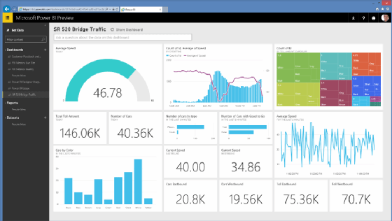
For automated delivery, Tableau relies on subscriptions, which email a view or workbook as a PNG image, a PDF, or both after an extract refresh runs. You can configure recipients, schedule, and format from the browser, and the feature is included with Tableau Cloud and Server licenses.
That works well up to a point. But subscriptions are still static snapshots. There is no native PowerPoint output, no live data in slides, and no easy way to personalize one report for many recipients. If the end result needs to be a polished deck with current numbers, Tableau alone usually does not get you there.
Best for: Teams that need strong interactive dashboards and are comfortable delivering reports as PDFs or images to people who already work in Tableau.
Pros:
- Native scheduling included with the license
- Excellent visualization capabilities
- Large community and strong support ecosystem
Cons:
- Scheduled delivery is limited to PNG or PDF, with no slide output
- No native report bursting; personalization typically means duplicating workbooks
- Tableau Desktop has no native scheduling and requires Server or Cloud for automation
Pricing: Tableau Cloud starts around $75/user/month. Current pricing →

2. Power BI
Power BI is Microsoft’s BI platform, and that matters. If your organization already runs on Microsoft 365, Power BI fits naturally into the rest of the stack through Teams, SharePoint, Excel, and the broader Microsoft ecosystem.
For automated delivery, Power BI offers subscriptions for email snapshots and Power Automate for more complex workflows. On F2 and P1 licenses, Copilot can also generate natural-language summaries of report data, which is useful when reports need to be turned into executive-facing updates.
The tradeoff is similar to Tableau’s. Scheduled delivery is still largely static, whether that means images or PDF. PowerPoint export exists, but the file contains screenshots captured at export time rather than live-linked data that updates on its own.
Best for: Microsoft-heavy organizations that want BI and reporting inside the Microsoft ecosystem, with a path to AI-generated summaries.
Pros:
- Deep Microsoft 365 integration across Teams, SharePoint, and Excel
- Copilot can generate text summaries from report data
- Strong self-service analytics for business users
Cons:
- PowerPoint export is based on static images, not live data
- Copilot requires F2 or P1 licensing
- Subscription scheduling is less granular than Tableau for complex multi-recipient use cases
Pricing: Power BI Pro starts at $10/user/month; Premium capacity starts at $4,995/month. Current pricing →
3. Rollstack
Rollstack sits in a different part of the stack from Tableau, Power BI, or Looker. It is not another BI platform. Instead, it connects to the BI tool you already use and automates the delivery of recurring reports into PowerPoint and Google Slides.
Teams map charts, tables, KPIs, and text fields from their source system into a template, then schedule updates and distribution. When the report runs, the latest data is pulled into the existing format automatically. That removes the manual export, copy-paste, and slide cleanup work that usually happens after the dashboard is already current.
That distinction matters because many BI teams have already solved analysis and data freshness. The remaining bottleneck is the last mile: board decks, exec updates, client scorecards, and QBRs that still get rebuilt by hand. Rollstack is strongest in those use cases, especially when one template needs to generate many variants across accounts, regions, or business units through Collections. It adds another layer to the stack, but for teams losing hours in slide prep, it solves a different problem than the BI tool does.
SoFi’s data team cut slide prep for finance and BI reviews from six hours to 45 minutes per cycle using Rollstack. Full case study →
Best for: Teams that already have a BI layer in place and need recurring decks, board materials, or client reports delivered in a slide-ready format.
Pros:
- PowerPoint and Google Slides output, not just PDF or image snapshots
- Live BI data mapped into governed templates
- Collections supports multi-recipient reporting from one template
- Built-in distribution via email, Slack, and shared drives, plus template governance controls
Cons:
- Additional platform cost on top of BI tooling
- Requires an existing BI tool rather than replacing one (though can work out of Google Sheets)
- Template setup and content mapping take some minimal upfront work
Pricing: Rollstack pricing →
4. Looker
Looker, which has been part of Google Cloud since 2019, is architecturally different from Tableau and Power BI. Everything runs in the browser, definitions live in LookML, and reports query the warehouse directly instead of relying on extracts.
That structure gives Looker a real governance advantage. Business definitions live in the semantic layer rather than being recreated inside each dashboard, which makes it easier to keep metrics like revenue or churn consistent across teams. For organizations with compliance, audit, or cross-functional reporting requirements, that consistency matters.
The tradeoff is complexity. LookML has a genuine learning curve and usually requires engineering support to maintain. Scheduled delivery supports email and integrations such as Slack, and dashboard outputs include PDF, PNG, and CSV ZIP. But there is still no native slide output.
Best for: Data-mature organizations, especially on GCP, that care more about semantic consistency and governance than ease of setup.
Pros:
- Semantic layer keeps definitions consistent across reports
- Direct-to-warehouse queries reduce stale data issues
- Strong permissions and governance model
Cons:
- LookML requires real setup and maintenance effort
- Scheduled delivery covers PDF, PNG, and CSV ZIP, but not slide output
- Slower to deploy than Tableau or Power BI for teams without a GCP footprint
Pricing: Looker is sold through Google Cloud and priced by quote. Contact Google Cloud →

5. Metabase
Metabase is often the tool teams choose when they want people to actually use the BI product. The self-hosted version is free, setup is fast, and the interface is simple enough that most users can get started without writing SQL.
It also handles lightweight automation reasonably well. Dashboard subscriptions can be sent by email or Slack, with PNG or CSV output delivered on a set schedule. For internal reporting and early-stage teams, that simplicity is a feature, not a limitation.
Where Metabase starts to struggle is at scale. It works well for a modest number of internal reports, but it is less well suited to high-volume, client-facing, or heavily personalized reporting. Once you need more governance, more complex modeling, or more structured delivery workflows, you begin to feel the ceiling.
Best for: Startups and mid-market teams that want self-serve analytics quickly, without heavy IT involvement.
Pros:
- Open-source version is free and fast to deploy
- No SQL required for many common use cases
- Clean, accessible interface
Cons:
- Governance and permissions are more limited than in enterprise BI tools
- Not built for high-volume or personalized report distribution
- Less capable for complex data modeling
Pricing: Open source is free; Metabase Cloud starts at $500/month. Metabase pricing →
6. Sigma Computing
Sigma is a cloud-native analytics tool built directly on top of modern data warehouses such as Snowflake, BigQuery, Redshift, and Databricks. Its interface looks more like a spreadsheet than a traditional BI tool, which makes it approachable for business users without giving up analytical depth.
Like Looker, Sigma pushes computation down to the warehouse rather than relying on extracted datasets. That means the data stays current, and analysts can work directly on top of governed warehouse models.
Sigma does support scheduled exports and email delivery, but that is not the main reason teams choose it. Its real strength is the warehouse-native model and the way it gives non-technical users structured access to live data.
Best for: Warehouse-centric teams, especially on Snowflake, that want business users working directly on top of governed data without extract management.
Pros:
- Familiar spreadsheet-style interface on top of warehouse data
- No extract management; queries run directly against the warehouse
- Strong support for warehouse-native calculations
Cons:
- Delivery automation is available, but not a core differentiator
- Requires a cloud data warehouse
- Smaller community and ecosystem than Tableau or Power BI
Pricing: Quote-based. Sigma pricing →

7. Domo
Domo takes a different approach from the warehouse-first tools above. It combines data connectors, ETL, visualization, and reporting into a single platform, which can be attractive for teams that do not already have a mature data stack in place.
That all-in-one approach is Domo’s main advantage. Instead of stitching together multiple vendors for ingestion, transformation, dashboards, and distribution, teams can do more of the workflow in one place. Domo also includes scheduled reporting as part of that package.
The downside is lock-in. When your data pipeline, business logic, and reporting layer all live inside one platform, it becomes harder to swap out pieces as the stack evolves.
Best for: SMB and mid-market teams that want a single platform for pipeline, BI, and reporting and do not yet have warehouse infrastructure in place.
Pros:
- ETL, visualization, and reporting in one platform
- Scheduled reporting included as part of the broader platform
- Faster to stand up for teams starting from scratch
Cons:
- Greater platform lock-in across data, logic, and reporting
- Can get expensive at enterprise scale
- Less visualization depth than Tableau or Power BI for more advanced analysis
Pricing: Quote-based. Domo pricing →

8. Looker Studio
Looker Studio’s biggest advantage is simple: it is free. If most of your data lives in Google products like GA4, Google Ads, BigQuery, or Sheets, it is an easy way to build and share reporting without additional software cost.
That makes it a sensible starting point for marketing teams and smaller companies. It works well inside Google Workspace, the template library is large, and it covers a lot of basic dashboarding needs without much setup.
Its limitations show up once the use case becomes more enterprise-oriented. Scheduled delivery is limited to PDF via email, transformation capabilities are relatively light, there is no semantic layer, and the connector story gets thinner outside the Google ecosystem. For teams already running Tableau or Power BI, it is usually not the right tool to add.
Best for: Marketing teams or small organizations with Google-centric data that need free, shareable dashboards.
Pros:
- Free
- Native connectors for Google data sources like GA4, Ads, and Search Console
- Easy sharing and collaboration in Google Workspace
Cons:
- Scheduled delivery is limited to PDF via email, with no slide output or live presentation layer
- Limited for more complex, multi-source enterprise reporting
- Usually not the right fit for BI teams already invested in Tableau or Power BI
Pricing: Free. Looker Studio →
If your team runs Tableau, Power BI, or Looker and someone still rebuilds the same slide deck before every exec meeting or client QBR, that is usually a sign that your reporting stack covers analysis but not delivery.
Rollstack connects to your existing BI tool, maps live data into your slide template, and delivers updated presentations on a schedule. See it in action →
How to choose an automated reporting tool
Start with the bottleneck. "We need better reporting" is too vague to be useful.
If the issue is data freshness, look at the BI layer. Tableau, Power BI, Looker, and Sigma all solve scheduled refresh reasonably well.
If the issue is self-serve access, pick the tool that makes sense for the actual users. Metabase and Looker Studio tend to be easier to roll out to less technical teams.
If the issue is slide prep, stop pretending it is a dashboard problem. Native BI subscriptions can send a snapshot. They do not build the presentation your VP or client expects to receive.
If you are starting from scratch, Domo may reduce the number of moving parts. If you already have a warehouse and BI layer in place, it can feel like buying a second stack you did not need.
In practice, plenty of mature teams land on a split setup: one tool for analysis and a separate tool for delivery. That is not redundancy. It is two different jobs.
When a BI tool alone is enough: If stakeholders already log into dashboards and know how to work inside them, native scheduling may cover most of what you need. PDF subscriptions are often enough when the audience is other analysts or operators rather than executives or clients.
The most common buying mistake: Teams add a delivery layer before the data layer is ready. If dashboards are stale, definitions are inconsistent, or every meeting turns into an argument about the numbers, automating delivery will not solve the underlying problem. Fix the data first, then optimize distribution.
Comparison table
Frequently asked questions
What is an automated reporting tool?
An automated reporting tool generates and delivers reports on a schedule without requiring manual work each time. In practice, that means two things: automatically refreshing the underlying data and delivering the result in a format stakeholders actually use, whether that is a dashboard, PDF, email, or slide deck. Most BI tools handle the first part well; the second is where they differ.
Which automated reporting tool is best for BI teams?
That depends on the bottleneck. Tableau and Power BI are the standard choices for dashboarding and self-service analytics in many enterprise environments. Looker is strong when semantic consistency and governance matter most. Metabase works well for teams that need quick self-serve access on a tighter budget. If the real issue is getting live data into formatted presentations, that is a delivery problem rather than a dashboard problem.
Why aren’t tools like Whatagraph, AgencyAnalytics, or Databox on this list?
Because those tools serve a different use case. They are often built for marketing agencies, channel reporting, and client-facing performance dashboards across SEO, PPC, and social media. This guide is narrower: it focuses on BI and data teams comparing dashboard platforms and delivery-layer tools for recurring business reporting.
Can Power BI or Tableau export to PowerPoint automatically?
Sort of. Both Tableau and Power BI can export reports to PowerPoint, but the exported slides are static snapshots rather than live data. In most cases, someone still has to trigger the export and update the file. If you need presentations to refresh and deliver automatically on a schedule, you need a separate delivery layer on top of the BI tool.
What's the difference between automated reporting and a dashboard?
A dashboard is usually a pull experience: stakeholders log in and explore the data themselves. Automated reporting is push: the system sends an update on a schedule. Dashboards are better for exploration; automated reporting is better for recurring communication with people who are unlikely to check a BI tool on their own.
How much do automated reporting tools cost?
The range is wide. Looker Studio is free. Power BI Pro starts around $10 per user per month, while enterprise capacity is much more expensive. Tableau Cloud starts around $75 per user per month. Rollstack starts at $750 per month for teams. In practice, pricing changes often enough that vendor pricing pages are the safest source.
Can automated reporting tools handle client reporting at scale?
Most BI tools are not designed for highly personalized, multi-recipient delivery. You can often make it work, but it usually means duplicating views, workbooks, or manual steps. Tools built for delivery are better suited to that use case because they can generate multiple versions from one template and route each version automatically. If that is the workflow you are solving, How to Automate Client Reporting is the more specific guide.
Do I need to replace my BI tool to automate reporting?
Not necessarily. If your main issue is dashboarding or self-service access, a BI tool may be enough. If your main issue is turning dashboard data into recurring presentations, you may only need to add a delivery layer on top of the BI system you already have.
Wrapping up
Every tool in this list can automate something. Most will refresh data, send a scheduled email, or share a dashboard. That is enough if your audience is comfortable living in dashboards.
The problem changes when the output has to look like a real presentation. Then you are no longer choosing a dashboard alone. You are choosing how the last mile gets done.
If you are buying a BI platform from scratch, Tableau and Power BI are still the default starting points for a lot of enterprise teams. Looker makes sense when semantic consistency matters a lot. Metabase is appealing when speed and budget matter more than governance.
If you already have the BI side covered and the manual work still happens in slides, the missing piece is probably delivery. Rollstack is worth evaluating →
Also worth reading: how to automate Power BI reports, the Power BI scheduled export guide, and the report automation comprehensive guide for the broader workflow.
Ready to close the gap between your BI tool and the board deck?
Connect your BI tools directly to slides, docs, email templates and more. Leverage your existing dashboards to update 100s of presentations on a schedule, saving your team hours of manual work.
See it in action →
Ready to close the gap between your BI tool and the board deck?
See how finance teams automate the full delivery layer: from governed BI data to formatted, distributed board materials, without manual exports.